Webull

Financial services, Trading Platform & Tools
Redesigned the app to improve the user experience and make problem-solving more intuitive.
# Product / UX / Visual
# App
# Problem Solving
Projects
Team Project
(2 Designers)
Duration
6 Weeks
Sector
Trading Platform,
Finance
Methods
User Research, User Interview, Competitive Analysis,  Visual design, Prototyping, Testing
My Role
Analyzed Webull’s user flows to identify pain points through competitor benchmarking and user feedback. Redefined key areas, restructured the information architecture, and iteratively refined UI designs through usability testing. Ensured design accuracy through close implementation checks and established UI consistency with a scalable design system.
Project Overview
Overview
Webull is a commission-free trading platform designed for a wide range of users from beginner investors to experienced traders.
It offers real-time market data, advanced charting tools, technical indicators, watchlist customization, a social community, and paper trading features to support user engagement and self-directed learning.However, due to its feature-heavy structure, users often experience friction in onboarding, navigation clarity, and overall accessibility for beginners. These usability challenges present key opportunities for UX improvements that can enhance user satisfaction and retention.
Goal
While Webull offers strong trading tools, many users struggle with its complex and unintuitive UI. Around 35–40% of negative reviews cite confusion, and an estimated 55% drop off within 7 days. The lack of localization further impacts U.S. based users. This redesign focuses on simplifying the interface, emphasizing key features like real-time charts and portfolios, and improving navigation and tone to enhance retention.
  1. Localized Experience for U.S. Users: Adjust text tone, color contrast, and financial terminology to align with U.S. user expectations, creating a more familiar and intuitive experience.
  2. Prioritization of Core Features: Minimize low-usage functions and visually emphasize key features like portfolio tracking and real-time charts to improve user flow and task efficiency.
  3. Enhanced Visual Clarity and Interaction: Use adequate spacing and clear button design to reduce cognitive load and support faster recognition and interaction.
  4. Improved Onboarding to Reduce Early Churn: New users often misunderstood the empty state on the home screen as a system error or an incomplete setup, which led to confusion and hesitation.
    To address this, we prioritized displaying popular stocks and frequently viewed items in that space, providing immediate value and guiding users toward a more intuitive and confident first-time experience.
These improvements can effectively help Webull reduce user attrition.
Key Features
Problems
  • Users had to go through an average of 3 to 4 steps to reach their target page, and as a result, approximately 60% of test participants reported confusion about their current location within the app.
  • Some icons did not match the associated content, leading 45% of users to land on unexpected pages (e.g., tapping "Market" led to a "Discover" page).
  • Unclear buttons and weak visual hierarchy led to low recognition of key features.
Solutions
  • We simplified navigation to a maximum of two steps and consolidated overlapping features, resulting in a 40% reduction in task completion time.
  • By aligning icons, buttons, and pages with the appropriate content, we improved the Expectation Match Rate by 30%.
  • Clearer button labels improved click-through and feature recognition.
Design Process
How might we..
What’s the best way to organize information and clarify design elements to help users stay focused and reduce drop-off on Webull?
Research
Part 01
First impression evaluation
Before redesigning the app, we created an unbiased environment for first-time Webull users to experience the product, while also involving users of other stock trading apps in the testing process. As part of our market research, we explored a range of trading apps and conducted a comparative analysis of three key competitors. We also reviewed app store feedback to identify recurring user complaints and common pain points. Based on these findings, we conducted early user interviews and workflow-based usability testing to uncover critical usability issues and synthesize overlapping feedback into clear, actionable insights.
Method :  App Store Review, Market Research, Initial interview
App Store Review
Market Research
Initial interview
App Store Reviews
Based on an analysis of 100 App Store reviews, approximately 68% of users responded positively to the app's access to global stock information and its ability to facilitate information sharing among users.On the other hand, 32% of users left negative feedback, mainly pointing to issues such as a cluttered UI, lack of intuitive design, and software bugs.Among the negative reviews, 45% mentioned UI discomfort, and 35% cited a lack of design clarity as the most frequently raised concerns.
Initial interview
Additionally, to improve Webull’s user experience, we conducted 1:1 usability interviews with six participants, ensuring a gender-balanced group. The participants included both first-time Webull users and users of other trading apps. We collected insights on their first impressions, navigation flow, and points of confusion.Through these interviews, we were able to identify recurring issues beyond what was found in app store reviews. Common pain points included information overload, unclear navigation labels, and a lack of visual hierarchy.
These findings played a key role in shaping the direction of our redesign strategy.
*Certainly, there's ample space for refining my research approach here! I delve further into this in my conclusion...
We conducted 6 user interviews and analyzed 100+ app reviews to uncover recurring usability issues, especially around confusing UI and unintuitive design.
These insights played a key role in identifying and prioritizing areas for improvement.By collecting and categorizing user feedback, we were able to define the most pressing usability issues and guide a structured redesign process.This approach allowed us to address user pain points more effectively and systematically.We also focused on analyzing the most frequently mentioned feedback to ensure that the redesign aligned with actual user needs and expectations.
Early User Insights
01
When I open the app, the Watchlist is empty and I don’t know where to start.
02
There’s so much going on that I get confused about what to tap first.
03
The text is too small, especially on charts hard to read on mobile.
Part 02
Understanding the problem.
Understanding user frustrations is just the beginning.Strategic UX methods allow us to reframe these findings into design opportunities, clarify direction, and reduce subjective decision-making.
1. Overwhelming information architecture
  • First-time users often struggle to identify what matters due to excessive and unstructured content.
    → We need to reduce visual noise, streamline the content hierarchy, and guide users toward the most important actions.
2. Poor readability and interaction usability
  • Small text sizes and narrow tap areas lead to discomfort, especially for new or older users.
    → Improving typography, spacing, and touch targets is essential to enhance accessibility and comfort.
3. Complex and deep navigation flows
  • Multiple menu layers and endless scrolling make it difficult for users to complete tasks efficiently.
    → Simplifying user flows and surfacing key features can significantly reduce friction.
4. Lack of localization for the U.S. market
  • Some wording and visual elements feel unnatural or unfamiliar to U.S.-based users.
    → UI components, tone, and content should be adapted to better match U.S. user expectations.
Method :  Competitive Analysis, Brainstorming, Empathy mapping, Problem Statement, User Storyboarding
Competitive Analysis
Through competitive analysis, we identified why other apps are preferred over Webull.
Webull is perceived as a feature-rich, advanced platform, but its complex UI creates a high barrier to entry for beginner users.
Through competitive analysis, we identified the features and UI elements that matter most to users, helping us clarify the direction for redesign.
Brainstorming
Brainstorming helped us prioritize real user issues, add new ideas, and organize abstract problems into actionable solutions.
Key issues identified included a complex layout, small font sizes, and redundant navigation structures. Based on these findings, we conducted a brainstorming session and organized the results under three core UX themes: readability, accessibility, and usability.
This process also focused on defining long-term goals and potential obstacles, helping the team align on a shared direction and break down goals into actionable steps.
From Empathy to Problem Definition
Based on initial user reviews and mid-stage usability testing, we used empathy mapping to better understand the frustrations and emotional barriers faced by beginner investors using Webull.By visualizing what users think, feel, and experience,we were able to define a clearer and more reliable problem statement.This process helped align our team around the most critical usability challenges and guided our design direction with a user-centered focus.
User Storyboarding
This user journey highlights how confusion and complexity reveal the need for a more intuitive investing experience.
Everyone around me is investing these days... Maybe it's time I give it a try too.
The reviews are good and there are no fees. this one looks like a good choice.
Why is there so much going on on the screen? It feels overwhelming... Is this really a stock app for beginners?
I’m new to investing, but this feels like it’s made for advanced users...
Other apps feel way more intuitive… Why did they make this one so complicated?
Looks like other users are running into the same issues I am.
First and foremost, beginners need a clear and simple path to get started quickly.
Now I can finally start
investing without feeling overwhelmed!
Design
Information Architecture
After brainstorming the app’s core features with a focus on user flow, I utilized the Crazy 8 technique to rapidly sketch key ideas. These sketches were then translated into detailed wireframes to visualize the relationship between features and user goals, helping refine the structure and usability of the Webull app.
Crazy 8's
1. Crazy 8's Process:
  • Team member quickly sketched 8 ideas.Sketch was created within a limited time frame.
  • Sketch was created within a limited time frame.
2.Convenient Spending Management:
  • The team members voted for the most well-organized page among the sketches.
  • This process helped generate a variety of ideas quickly and reflected the team's opinions in selecting the best design.
Wireframe
To address the usability issues identified in the early research phase, we created a revised wireframe focusing on structural clarity and simplified navigation.
  • Redundant pages were merged to streamline the information hierarchy, and key features were repositioned for easier access within one or two taps.
  • We also explored ways to utilize empty areas on the home screen more effectively by allocating space for stock-related content and category highlights.
  • The “Menu” section in the bottom navigation was reconsidered and redefined as “Profile,” ensuring the label and icon better align with the intended functionality.
While the revised wireframe addressed some key usability issues, challenges around icon clarity and screen-to-screen navigation still remain.In particular, further improvements are needed to enhance feature accessibility and structural clarity, especially from the perspective of beginner users.We plan to conduct usability testing to evaluate how these elements affect the overall user experience and refine the layout accordingly.
Mid-Fi Prototype
Once we were all aligned on the concept, I created wireframes on Figma to lay the groundwork for future designs.
Male 29, Robotics Technician
Female 22, Student
Female 27, Sales
Usability Test Tasks
We conducted a formative usability test with six participants, measuring each task’s success rate, failure rate, lostness, number of clicks, time taken, and perceived difficulty (on a 1–5 scale) through direct observation and user feedback to identify usability patterns and areas for improvement in the redesigned UI.
  • Completion rate (Success Rate) = (number of successful attempts ÷ total participants) × 100
  • Failure = number of users who couldn’t complete the task
  • Lostness = number of users who showed hesitation, confusion, or navigated to the wrong screen before completing the task
  • Clicks and Time were recorded manually during observation
  • For difficulty ratings, participants rated each task on a 1 (very difficult) to 5 (very easy) scale, and we calculated the average.
User Difficulty Rating
Usability Test Results
David Craib
“Design should never say,
'Look at me.'It should always say, 'Look at this.”
Final Screen
Final Design for iOS
When users first launched the app, many felt confused by the blank screen, and some even assumed there was an error. To improve this initial experience, we displayed trending and popular stocks on the first screen, helping users begin exploring right away.

Additionally, all six participants in previous usability tests were confused by the label “Menu,” which was functionally closer to a profile section. To resolve this, we changed the label from “Menu” to “Profile” to better reflect its purpose and improve clarity.

Furthermore, “Search symbol” and “Explore opportunities” were previously placed as small inline buttons, which many users failed to recognize as clickable elements. To address this issue, we fixed them at the top of the screen and redesigned them with a clearer button-style UI to enhance both accessibility and recognition.
In previous user tests, most participants did not realize that the “News” and “Daily” buttons only became active after adding stocks to Favorites. Even after activation, many users mistook them for static text due to their small size and lack of visual cues.To address this issue, the experience was redesigned so that once a stock is added to Favorites, the section updates automatically and relevant news and daily information are immediately displayed at the bottom of the screen.

Previously, long-pressing a favorited company caused unnecessary interface conflicts, such as duplicate appearances of “Search symbol” and “Explore opportunities.” To resolve this, those elements were fixed at the top of the screen for consistent visibility, and a swipe-left-to-delete feature was added to individual items for easier control.

Lastly, the hamburger menu at the top of the Favorites section was improved to allow users to access more detailed settings for each item.
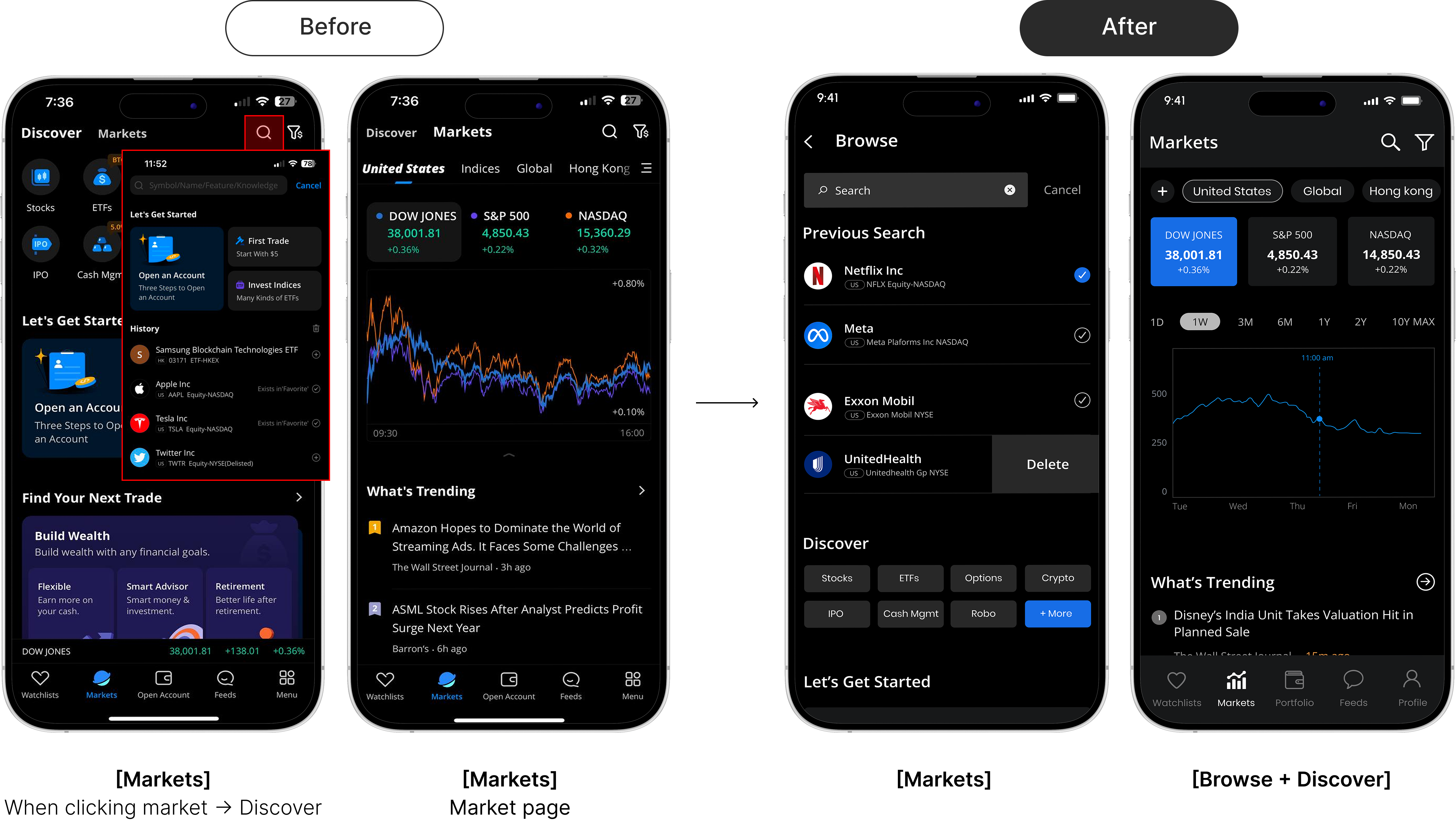
When users clicked “Market,” the Discover page appeared first, causing confusion. This issue worsened when clicking the search icon also led to the same Discover page, creating redundant navigation. To resolve this, we combined the Discover and Search pages and ensured that clicking “Market” takes users directly to the Market page. Interestingly, Webull’s official update later removed the search page, reflecting a similar conclusion drawn from our usability testing and design recommendations.

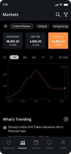
In the “Market” section, Dow Jones, S&P 500, and Nasdaq graphs initially overlapped in one view, which made the interface visually confusing. We improved this by allowing users to tap each index to view individually color-coded charts. We also redesigned the top category bar to visually distinguish it as a clickable, interactive element.
On the company detail page, many users struggled to distinguish between buttons and plain text. To address this, we refined the negative space and visual hierarchy to clarify the structure and improve usability.

The UI was also simplified by showing only the “Search” and “Favorites” icons at the top, addressing concerns about screen clutter.
Interestingly, similar changes were reflected in Webull’s recent official update.Previously, tapping the search icon led to different content depending on the page, causing user confusion.

In some cases, a To-Do list appeared instead of actual search results, which didn’t align with the function’s name.
We resolved this by combining recent searches, Discover-style recommendations, and the To-Do list into a single unified view, enhancing both clarity and consistency in the search experience.
01
Improve First Impressions
By displaying trending or recommended content on the home screen, we can prevent users from feeling confused when they first enter the app.
02
Simplify Stock Screen UI
Reorganized buttons, fonts, and spacing to improve readability and help users quickly understand key stock information.
03
Refine Profile Structure
Streamlined redundant pages and reorganized icons to reduce user confusion and highlight only essential features.
Style Guide
Steve Jobs
“Design is not just what it looks like and feels like.
Design is how it works.”
Usability Test
We conducted a usability test with 6 participants using the mid-fi prototype. Each completed 10 tasks and answered questions about design and usability. We measured task success, time taken, and gathered feedback. A System Usability Scale (SUS) test was also conducted to assess overall usability.
Female 23, Accounting Assistance
Female 27, Sales
Female 25, Student
Conclusion
Moving Forward
  • User-Centered Improvements: Continuously incorporate user feedback to keep the app intuitive and user-friendly.
  • Feature Prioritization: Focus on enhancing and expanding key features based on user needs and market trends.
  • Optimization: Optimize performance around core features to ensure a smooth and efficient user experience.
What I  learned
  • Sharing the problem-solving process with my team significantly improved my communication skills and deepened my understanding of the importance of collaboration. Especially when facing difficult challenges, working together allowed us to consider and address aspects I might have overlooked on my own, making the experience invaluable.
  • I learned the importance of focusing on core elements and creating an intuitive design rather than including every feature. I also discovered how to use empathy, saturation, and size to clearly convey functions to users. Additionally, I understood the value of incorporating user feedback to continuously improve the design. This experience highlighted the importance of user communication in achieving better results.
  • Interestingly, several features we explored were later reflected in Webull’s actual product update, reinforcing the value of early user feedback and validating our design direction.
© 2025 Designed by Jisoo Kim