Lubricant Label Design

Package Design · Branding · Label · Beauty
Developed full packaging and labels for Dr.Girls’ flavored lubricant series, including bottle sourcing and visual styling.
# Package & Label
# Graphic Design
# Product Development
# Dr.Girls
Projects
Solo Design
Duration
1 Month
Sector
Package, Graphic Design,
Label, Product Development
Methods
Research, Competitive
Analysis,  Visual design,
Branding
My Role
Led the visual design of a private-label lubricant product in collaboration with JO. Designed the label based on product specifications and selected the bottle shape, cap style, and color scheme to ensure brand consistency across all packaging elements. Prepared the final production-ready files.
Project Overview
Overview
As the company sought to launch its own line of personal lubricants, we collaborated with a specialized manufacturer to develop a water-based lubricant under our brand. The project focused on establishing a visual direction aligned with the brand tone, including packaging and label design tailored to meet user expectations.
Goal
To develop a visually clear, safe, and approachable label design for a flavored personal lubricant product under a private label brand, in collaboration with JO.
  1. Functional Cap Design: A functional cap was selected to allow smooth and controlled dispensing of the gel, enhancing user convenience and hygiene.
  2. Transparent Bottle: Designed to make the remaining product amount easily visible, enhancing user convenience.
  3. Portable Size: The compact 2oz size is optimized for on-the-go use, offering discretion and portability for personal care routines.
  4. Popular Fragrance Selection: Based on market research, two consumer-preferred scents—sweet bubblegum and refreshing citrus were chosen to enhance emotional appeal and shelf presence.
Developed the product design by reflecting real sales performance and manufacturer input, ensuring a balance between user experience and market viability.
Initial Thinking
Target Users
  • Entry-level users seeking a light, approachable personal lubricant.
  • Practical consumers who prefer compact products suitable for everyday or on-the-go use.
  • Design-conscious lifestyle users who value subtle fragrance and aesthetic packaging.
  • Users looking for a refined, sensorial experience with their partner in a romantic or intimate setting.
Research Methods
  • Analyzed reviews of the best-selling lubricants on major e-commerce platforms.
  • Conducted market research and product development discussions with manufacturing partner JO.
  • Analyzed responses from online surveys to better understand user preferences.
  • Held internal stakeholder meetings based on survey findings and compared insights with separate market research for a more comprehensive perspective.
Design Process
How might we..
We create a lubricant that smells sweet, is easy to open, and enhances intimacy between couples?
Research
Part 01
Identifying Opportunity.
To reflect the latest market trends, I analyzed best-selling products on major online retailers and collaborated with our manufacturing partner to refine the design direction.I also conducted a brief survey to gather user feedback, which was incorporated into the design.
Method :  Market research, Partner Brand Research, Online Survey
Market Research
Partner Brand Research
Q1. What do you care most about when buying a lubricant?(e.g., scent, texture, ingredients, packaging, brand)
Q2. How important is scent to you when choosing a lubricant?
Q3. Have you had any issues with lubricant packaging? If yes, what kind? (e.g., leaking, hard to open, slippery, unclear label)
Q4. Do you prefer packaging that's easy to store or carry? If yes, What helps make it convenient?
Q5. Does the packaging design affect your purchase?
Q6. Do you find sexual imagery or models on lubricant packaging helpful or uncomfortable?
Optional follow-up: What level of imagery feels appropriate or excessive to you?
Interview Hight-lights
01
Using cosmetic-style designs or fruit illustrations instead of sexual imagery makes the product feel more discreet and suitable for carrying in public.
02
Scent is important, but having a sweet taste can make the experience more enjoyable and increase overall satisfaction.
03
A soft, squeezable plastic bottle is easier to use without applying much pressure. A one-handed, push-to-open disc-top cap would also improve convenience.
*Certainly, there's ample space for refining my research approach here! I delve further into this in my conclusion...
Packaging Design Insights
Beyond scent and flavor, packaging design played a key role in influencing customer choice and satisfaction.Survey results and internal discussions showed a strong preference for clean, cosmetic-style designs or fruit illustrations over sexual imagery, as they feel more approachable and less awkward to use.Additionally, soft, squeezable plastic material and one-handed disc-top cap structures were favored for their convenience and portability.Brand research also revealed that some competitors use high-saturation colors and minimal graphic elements to enhance visual impact both on shelves and in online thumbnails.
Design
Brand Message
Dr.Girls celebrates natural, confident intimacy.We thoughtfully design our products to support women in expressing themselves freely, anytime and anywhere. The “Dr.” in our name reflects a deep care and understanding for women’s bodies and emotions, with the heart of a trusted expert. No discomfort. No shame. A sensual, comfortable experience that makes every moment feel more special.
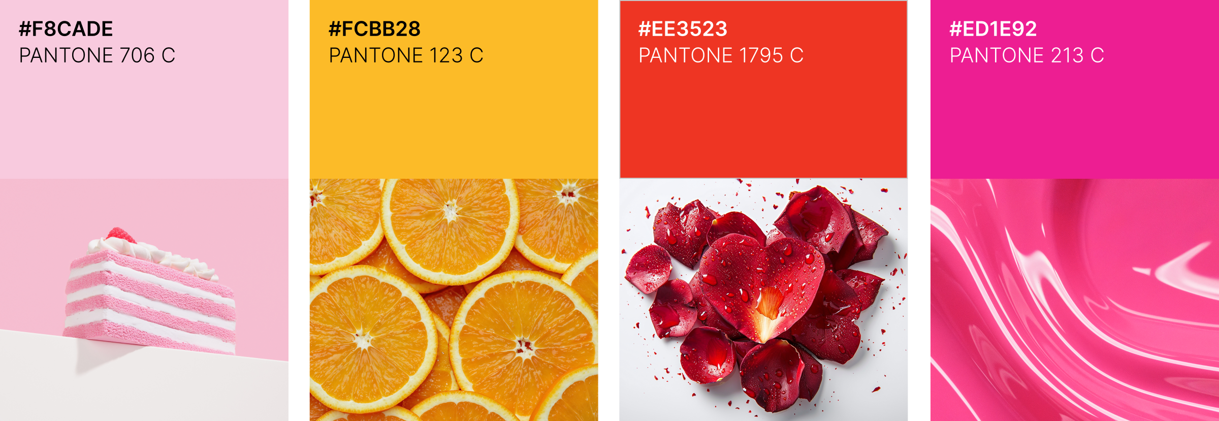
Colors
This color palette captures sweetness, vibrancy, love, and passion, visually embodying Dr.Girls’ message of natural, confident intimacy. It delivers both soft emotion and bold allure, evoking a sense of warmth and excitement.
Sketches & Ideation
During the package design process, we compared flip-top caps, disc-top caps, and tube bodies. Customer and internal feedback favored a soft, transparent plastic body for its ease of squeezing, and the disc-top cap was chosen for its one-hand operation and precise dispensing. The cap color was finalized in white to align with the brand tone, while transparent caps were excluded for hygiene reasons. The tube + flip-top cap combination was dismissed due to durability concerns and potential leakage.
Packaging Structure
This label design utilizes a transparent bottle that allows the product to be visible, adding a premium touch even at an affordable price point. The bold colors and clear imagery on the front capture attention, ensuring strong shelf presence among competitors. The label layout highlights the flavor and key product features at a glance, with dimensions optimized for the 2oz (60ml) bottle for easy application and storage. This design minimizes excess material usage while improving logistics and display efficiency, ultimately helping to reduce costs.
Final Screen
Final Package & Mock up
Feedbacks
Although the short-term sales impact was limited, we were able to gather valuable insights and accumulate data that can inform future marketing strategies. Building on this, we are continuously seeking new partnership opportunities and planning to venture into the chemical sector.
Female 28, Customer
The new packaging feels fresh and approachable! The clear bottle makes it easy to see the product, and the white disc-top cap is simple to use with one hand. It’s discreet yet stylish, which makes me feel more comfortable purchasing it.
Female, 32, Customer
Many cosmetic and chemical products are made in China, so I was impressed that Dr.Girls is produced in the USA. The American flag on the label gives me a sense of trust and makes me feel more confident about its quality and safety.
Female 40, Store Manager
The brand is still not well-known, so customers are less likely to purchase it. Most tend to choose familiar brands, so we are currently relying on affordable pricing and small promotional events to drive sales. Overall, the brand’s presence is still relatively weak.
Male 27, Customer
The disc-top cap is easy to use, the transparent bottle shows how much is left, and its portable size is convenient. I chose it for its price and because it’s made in the USA.
Conclusion
Moving Forward
  • Keep the transparent body with a white disc-top cap, enhancing visibility and appeal.
  • Continuously analyze consumer preferences, color trends, and packaging usability through market research to ensure the design remains competitive and relevant.
  • Integrate product imagery and key information into the label layout to instantly communicate flavor, volume, and usage, improving shelf readability and supporting purchase decisions.
What I  learned
  • Exploring a range of bottle formats and cap mechanisms allowed me to broaden my understanding of structural design, while integrating insights from customer input to shape the final product.
  • Bridging external feedback with in-house discussions, I guided the workflow with manufacturing partners and directed the process from initial concept through to finished goods.
  • Market observations revealed that buyers value compact, travel-friendly options and gravitate toward warm, approachable aesthetics rather than overtly suggestive visuals, reflecting both couple-oriented and individual use scenarios.
© 2025 Designed by Jisoo Kim