Special Day

Package Design · Branding · Hair Wigs · Beauty
Designed packaging that improves the customer experience by reducing unnecessary unboxing, keeping displays neat, and staying true to the brand’s visual identity.
# Package & Tag
# Branding
# Graphic Design
# Photography
Projects
Solo Design
Duration
3 Weeks
Sector
Package, Graphic Design, Photography, Beauty
Methods
Market Research, Customer Insight, Visual design,
Branding
My Role
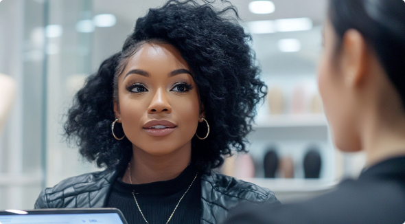
Visited beauty wig stores to conduct market research and gathered valuable feedback from store owners and customers. Based on this, I designed product packaging that reflects customer needs and preferences.
Project Overview
Overview
The original packaging for R&B Collection featured a sealed box design, which required customers to open the lid to see the product inside.
This didn’t align with the needs of shoppers who wanted to quickly compare products in-store, so I redesigned the structure to make the wig visible from the outside without opening the box.
Goal
Our goal is to deliver visually engaging packaging that resonates with the tastes and lifestyles of young women in their 20s and 30s. By allowing the product to be seen without opening the box, we enhance the shopping experience, increase customer satisfaction, and ultimately drive sales. Staying true to our brand name,"Special Day" we strive to make everyday moments feel special through thoughtful, design-driven experiences.
  1. Window Box: Designed with a transparent window, the packaging allows customers to easily view the product’s texture, color, and hairstyle without opening the box.
  2. Red & Black Colors: The use of red and black throughout the packaging enhances visibility and shelf impact, drawing customer attention in-store.
  3. Model Photo & Color Information: Model photos and detailed color labels have been added to the side of the packaging. Previously, only the wig name and color code were shown, which made it difficult for customers to identify the product at a glance when boxes were stacked.
These enhancements are intended to improve product recognition and make the shopping experience more convenient and customer-focused.
Initial Thinking
Target Users
  • African women in their 20s–30s who follow beauty and fashion trends.
  • African women of all ages who wear wigs as part of their daily style.
  • Women seeking wigs for special occasions or confidence enhancement.
  • Beauty supply store staff and managers who interact directly with customers.
Research Methods
  • Conducted phone and in-store interviews with customers and store owners.
  • Observed product displays and user interactions on-site.
  • Online research on customer reviews and market trends.
Design Process
How might we..
We create packaging that attracts attention, delivers clear information, and is easy to handle?
Research
Part 01
Identifying Opportunity.
To design packaging that reflects current trends, sales representatives across five states visited key beauty supply stores to conduct one-on-one interviews with customers and store managers, while the design team complemented these findings with online research.
Method :  Market research, Q&A Interview, Phone Survey
Market Research
Q&A Interview
Q1. What's the most important factor in wig packaging for your purchase?
Q2. Would a window on the packaging help with your decision?
Q3. (For store owners) What packaging colors or styles do customers prefer? Which products sell best?
- Why do you think these packages sell well? Or how do customers perceive this product?
Q4. What extra info would you like to see on wig packaging or wig tag?
Q5. How much does packaging design affect your buying decision?
Q6. Does the size or shape of the packaging impact convenience?
Q7. Does a model photo on the packaging help? What kind of model works best?
Q8. Would reusable packaging influence your purchase decision?
Q9. What packaging elements make a wig product look more premium or high-quality?
Q10. When displayed in a store, which type of packaging shape stands out more to you? (e.g., vertical, horizontal, foldable, etc.)
Q11. (For store owners) Any recent wig brands or packaging styles that customers liked?
Interview Hight-lights
01
A photo on the side of products makes it easier to organize and helps customers find what they need quickly.
02
Customers can check the wig's quality and color without opening the box, ensuring it meets expectations and reducing returns.
03
Red packaging grabs attention in stores, often boosting sales by standing out.
*Certainly, there's ample space for refining my research approach here! I delve further into this in my conclusion...
Improving Customer Experience Through Packaging and Design.
Placing product images on the side of the packaging makes inventory management much easier and allows for quick identification, even when items are stacked. Bold colors like red stand out on the shelf, helping customers locate products more quickly. An analysis of competitor products also showed that many use high-saturation colors to boost visual impact.
Additionally, compared to traditional box packaging, the transparent design allows customers to see the wig’s texture and color without opening it, reducing the gap between expectations and reality and contributing to a lower return rate.
Design
Brand Message
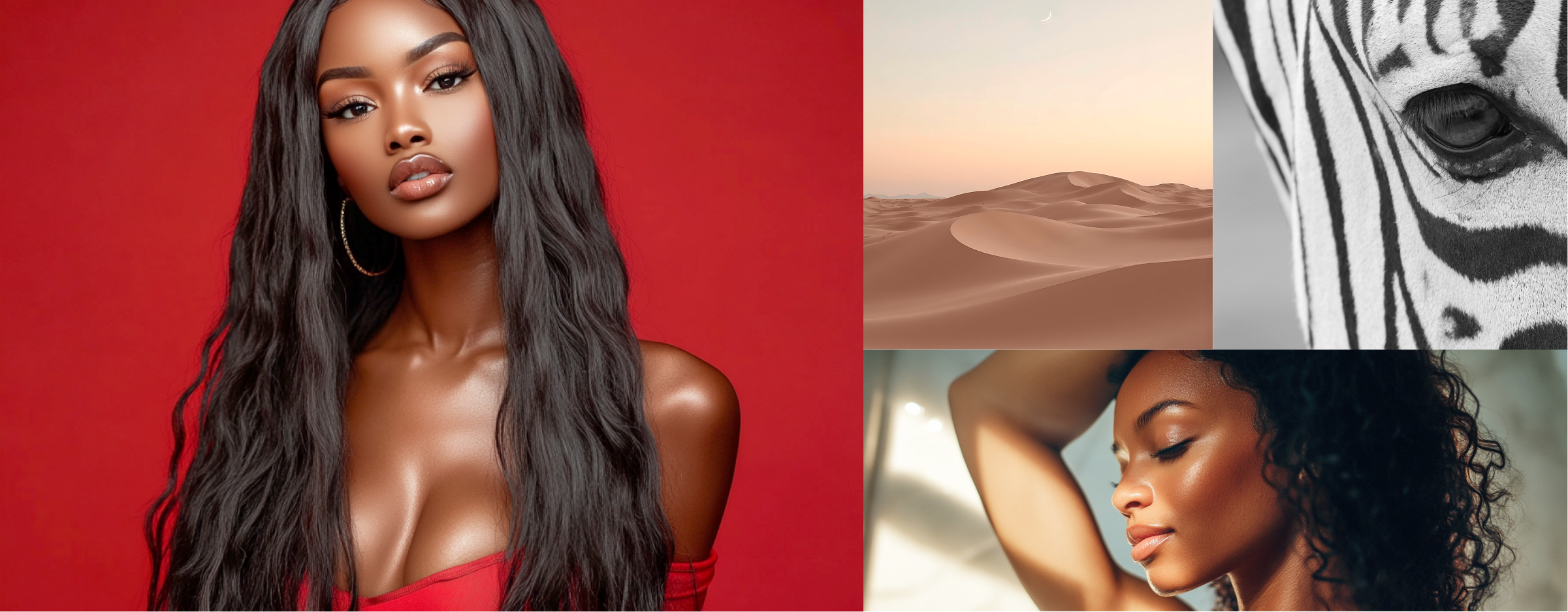
The name "Special Day" reflects our belief that every moment in daily life can feel extraordinary. Our goal is to help customers feel  confident and beautiful every time they wear our wigs.This philosophy is also reflected throughout our visual identity, inspired by the vibrancy, unity, and natural beauty found in African culture. Through our design and messaging, we aim to bring positive energy into everyday moments.
Colors
Crafted the color story to visually embody strength, identity, peace, and warmth, reflecting the spirit of African culture while aligning with the brand’s emotional narrative.
Logo
Concept
“Special Day” is a brand created for women who embody strength and confidence in their everyday lives. Its visual concept draws inspiration from African culture and symbolic colors, expressing confidence, identity, and the inner strength of women through thoughtful design. Through this, we aim to help our customers recognize their own value and feel empowered to shine in every moment.
Packaging Structure
The packaging features an open-window design that adds a premium touch even to budget-friendly products. Unlike traditional fully enclosed boxes that obscure the product, this structure allows for easy assembly and a clean finish, presenting a more refined image in-store. Bold colors enhance visual impact on shelves, helping the product stand out among competitors. Available in both long and short styles, the box sizes are optimized according to wig length, reducing excess packaging material and improving shelf efficiency, ultimately contributing to lower retail display and logistics costs.
Final Screen
Final Package & Tag
Feedbacks
After the redesign, we gathered feedback from customers, store managers, and sales representatives through store visits and interviews.Most participants noted that the new packaging feels more premium, makes product browsing easier, and improves display organization in stores.Overall, the design was praised for enhancing both brand consistency and in-store usability.
Female 25, Model
The new packaging feels more luxurious and easy to check in-store. It’s practical yet stylish perfectly balanced.
Male 36, Sales
Many brands use bold colors, but this one stands out with structure and strong branding. Customers notice the difference.
Male 45, Retailer
The side photo panel helps customers find products faster. Display looks cleaner, and organizing is much easier.
Female 27, Customer
The red packaging feels premium and eye-catching. I can see the style and color right away without opening the box.
Conclusion
Moving Forward
  • Arrange product photos and image-based information alongside the product.
  • We will add color swatches with actual product photos on the back of the tag inside the package for a more intuitive color selection.
  • To allow customers to view the hair without opening the box, we will incorporate a window and design various styles of open-type boxes.
  • Conduct regular market research to understand and analyze customer needs and preferences.
What I  learned
  • Visiting actual sales locations allowed me to directly observe consumer purchasing patterns and preferences, gaining a deeper understanding of how packaging, pricing, and store displays influence decision-making.
  • By conducting phone surveys, I analyzed market trends in distant regions, enhancing my ability to compare and assess regional consumer needs and preferences.
  • Discovered that small conveniences in packaging can significantly impact sales.
  • I identified differences in aesthetic preferences and design styles across ethnicities and incorporated these insights into customer behavior analysis to refine packaging strategies.
  • I analyzed various design drafts to develop optimal packaging styles, maximizing both functionality and visual appeal. Subsequently, I collaborated with factories in China and Indonesia to finalize designs and proceed with production.
© 2025 Designed by Jisoo Kim